Microsite
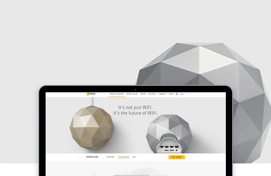
A fresh microsite for a new hardware product - Norton Core
A fresh microsite for a new hardware product - Norton Core
TL;DR
Norton needed a new microsite to launch Norton Core, its first secure router product. I led the UX and design work across the site, using wireframes, stakeholder feedback and customer testing to shape the experience. The visual direction had to introduce something new while staying connected to the Norton brand and the angular hardware design.
4Iterations
32Screens
6%Increased traffic
2%Additional revenue
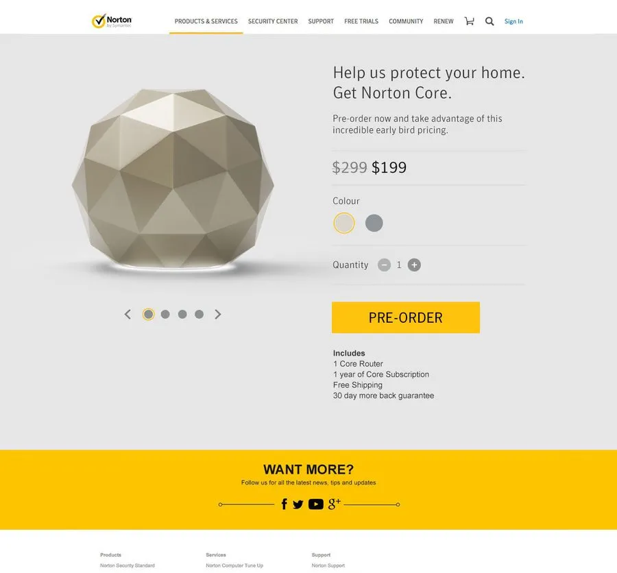
Norton launched a new secure router product called Norton Core, targeted at consumers interested in a router with security features built in. To promote the device, Norton needed a microsite: the business needed to promote the product’s unique features, effectively communicate why customers might be interested, highlight its compelling industrial design, and make it easy to complete a purchase. The site also needed to promote other Norton products and how they might work alongside Norton Core.
Working with the creative director primarily on ideation, UX and visual design, we created a number of iterations and approaches until we had a cogent experience that resonated with our customers.
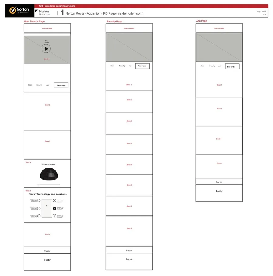
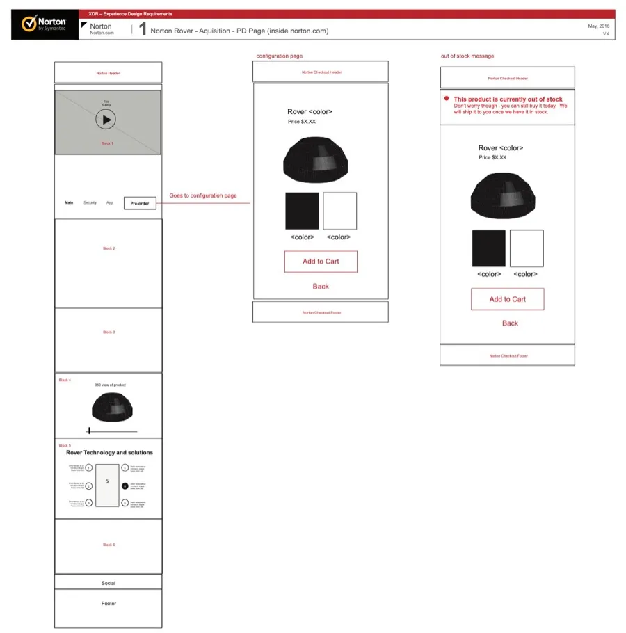
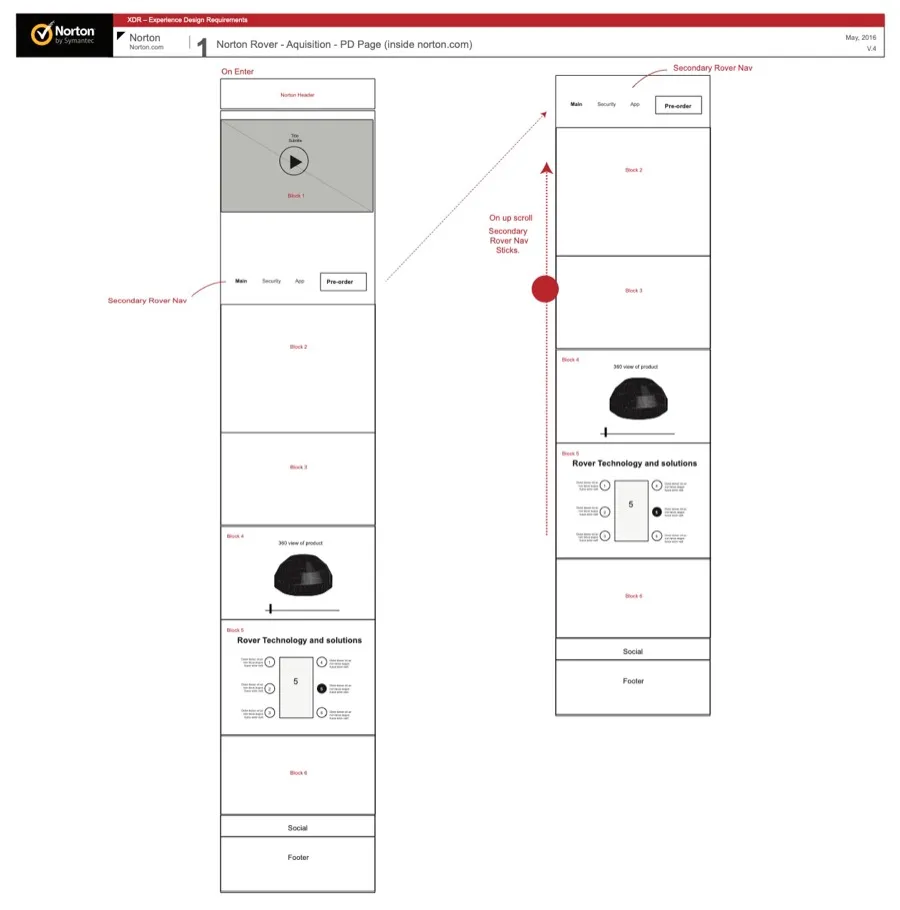
It was useful to do wireframes to get initial feedback and buy-in from a number of senior stakeholders in the business. Norton Core was a significant project with high visibility across the business, so we created a number of low- and high-fidelity wireframes to make sure our approach was right with both stakeholders and customers. We used the low-fidelity wireframes for initial stakeholder feedback and the higher-fidelity wireframes for user testing, which let us capture initial issues quickly since we could test rapidly and regularly. After three rounds of wireframes we had a solid set to use for visual design.
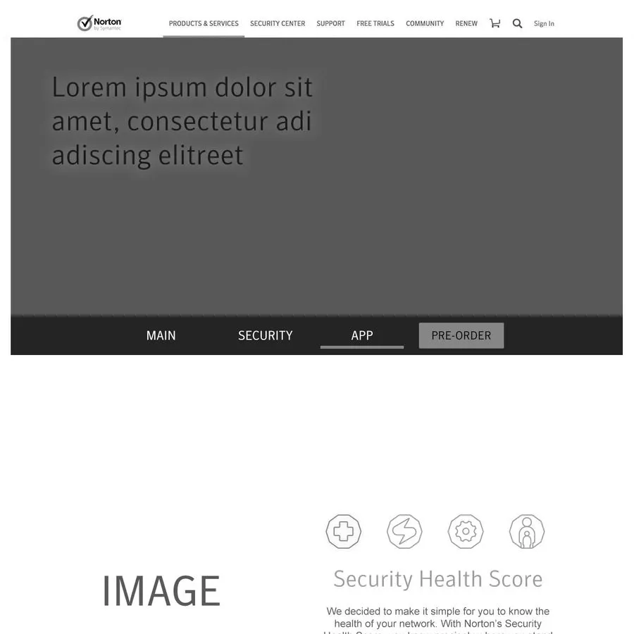
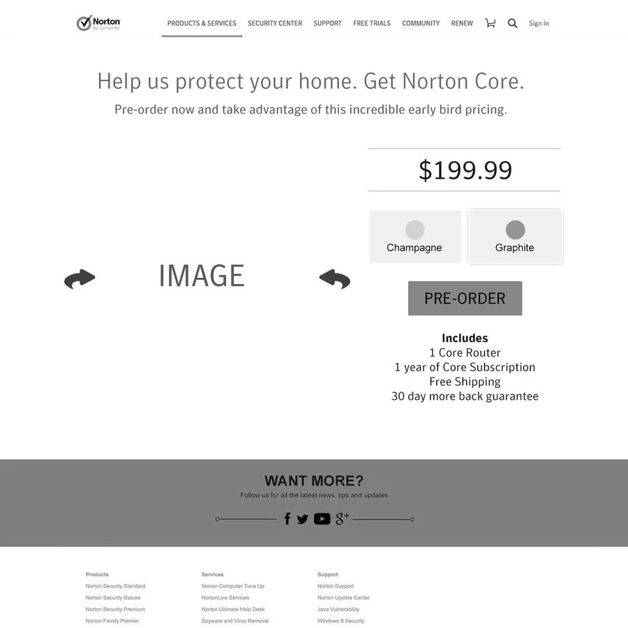
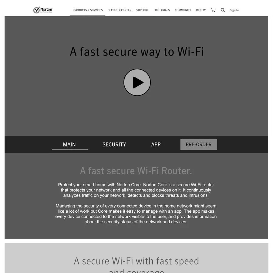
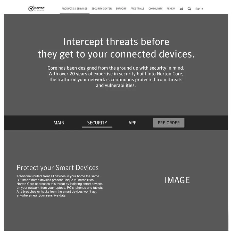
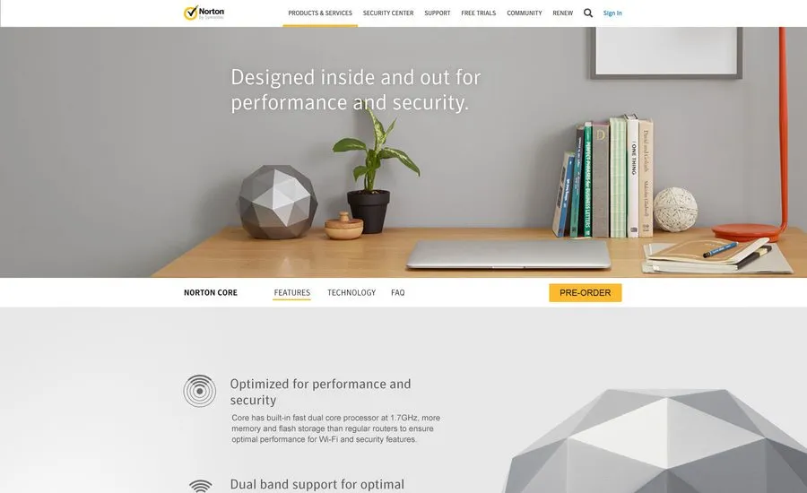
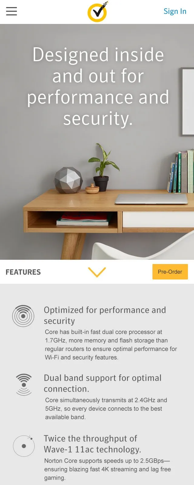
This was the first hardware product Norton had created, so it was important that the microsite felt on-brand yet also new and unique. We wanted the site to complement and emphasise the hardware design, which had an angular form with muted colour options. The design needed to be bold, modern and fit within the broader brand context and site design while still feeling distinct — I wanted a muted colour palette that let the imagery allow the product to take centre stage while still communicating key feature information.
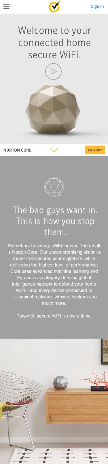
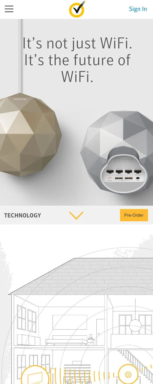
The site needed to work on multiple devices, so we used a responsive/adaptive hybrid layout, with specific breakpoints for mobile, tablet and desktop that remained adaptive within each width.
The design successfully addressed the business and user goals: promoting and clearly communicating the product’s features and unique offerings.
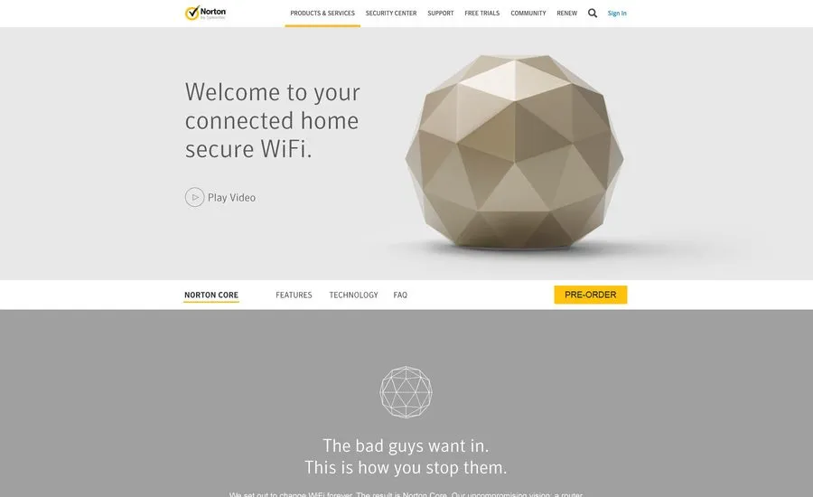
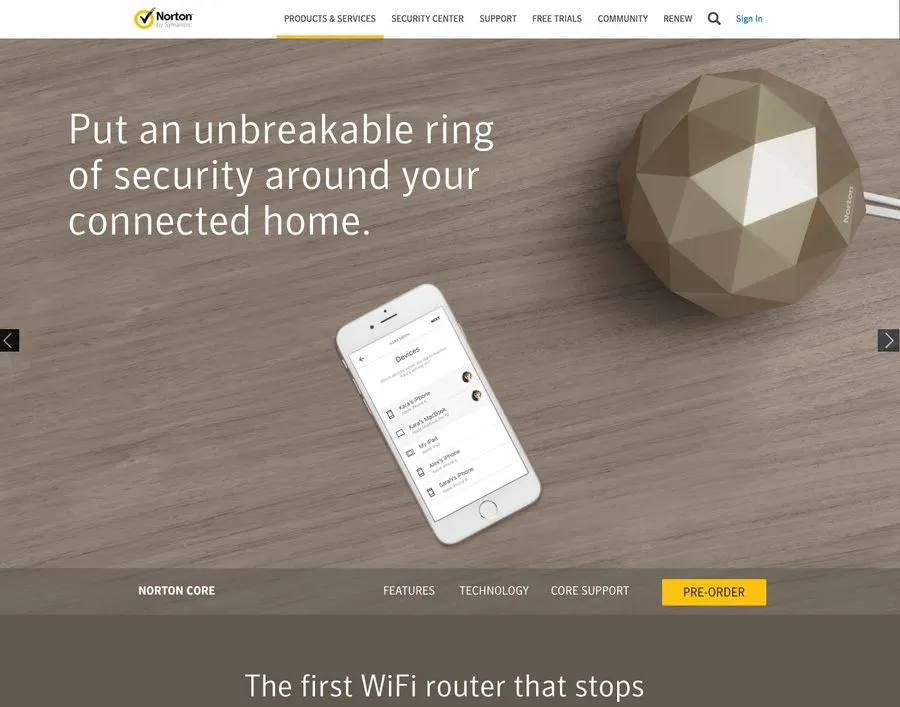
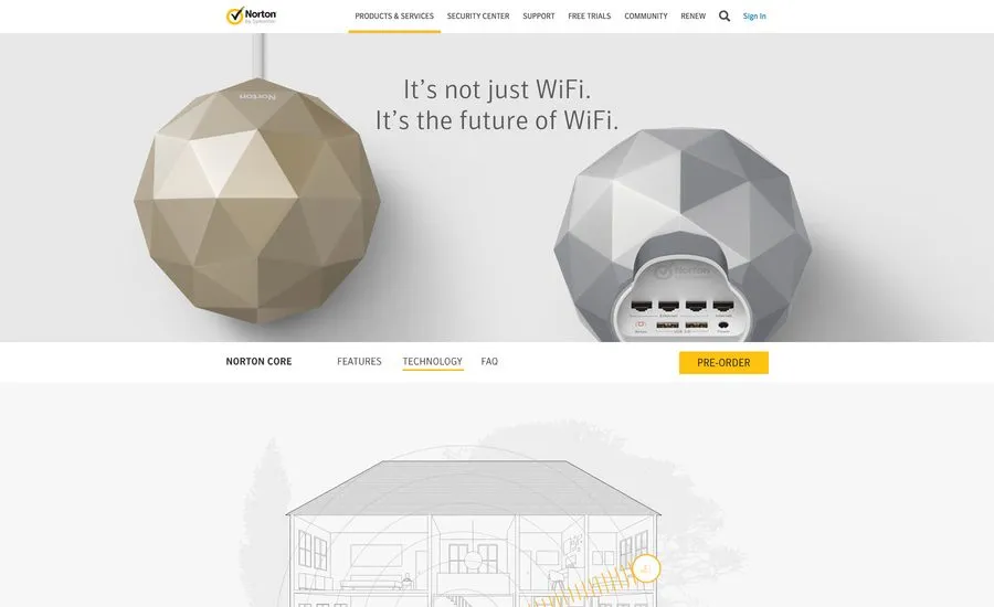
It was good to work on such a high-profile hardware product launch. The project was a unique opportunity, as hardware products weren’t something Norton usually undertook, so it was good to be involved. It also presented some new challenges, such as product photography in real-life environments, and we needed to add shipping requirements to our checkout, which had been removed in previous years. It was also beneficial to work cross-functionally with marketing and web development without the silos that had hindered projects in years past.