Design System - NortonLifeLock
Create a design system for the team to use to rapidly build out checkout flows.
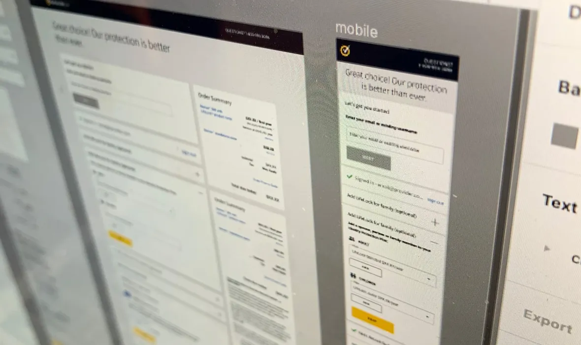
Create a design system for the team to use to rapidly build out checkout flows.
TL;DR
The checkout team needed a flexible design system that could support many brands, products and flow variations while designers moved from Sketch to Figma. I led the creation of the NortonLifeLock checkout system, defining reusable components, states and assets, and checking implementations for accessibility and the needs of different checkout journeys.
As my team migrated existing experience flows to use the new checkout experience, we needed a way to quickly conceptualise, design and build flows. The broader Product team was also migrating from Sketch to Figma, so it made sense to create the NortonLifeLock checkout design system in Figma. Since we create many different flows, we needed design assets we could use to quickly flesh out ideas and build out experiences the dev team could use as a source of truth.
As the original designer of our checkout, it made sense for me to do the work. I worked from our original Sketch files, then extended the new Figma-based library to provide all the assets a designer might need to deliver new flows for desktop, tablet and mobile. I used the Atomic Design methodology (Brad Frost), building out all the atoms, molecules, organisms and templates, and worked with the rest of the team to ensure the design system was robust enough to be useful without being too complex to be confusing.
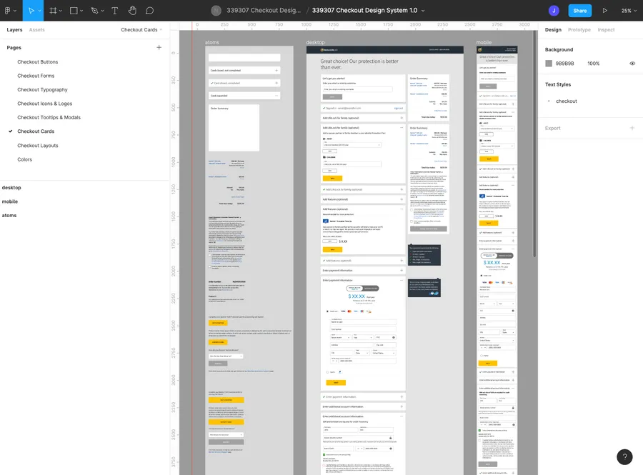
The “Cards” combined different UI elements into cohesive “organisms” that covered all the different states of the checkout. I wanted designers to have access to these organisms, as they form the foundation of the checkout and cover most states that would appear — making the task of creating any flow much quicker.
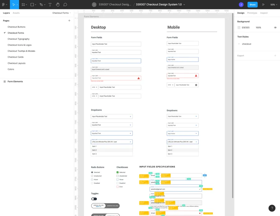
I built out the form fields and various states including:
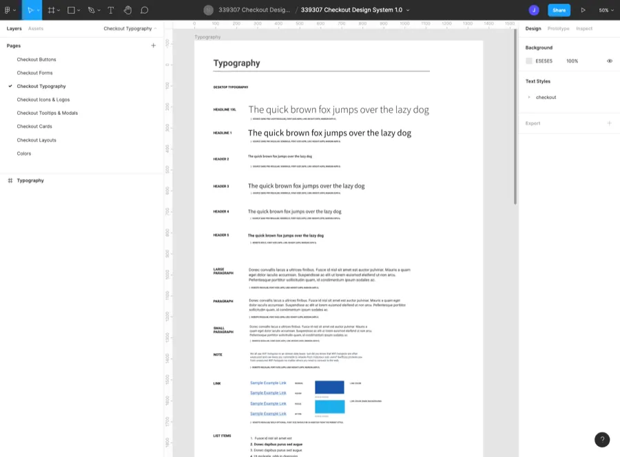
The fonts were mapped out to work with:
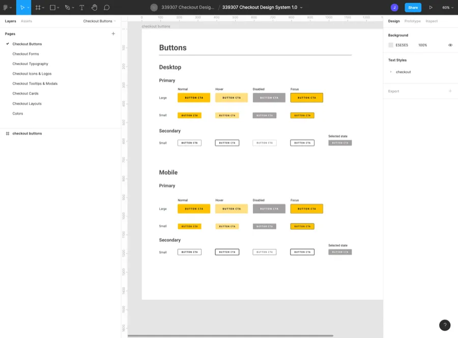
All primary and secondary buttons, as well as hover, press, disabled and focus states, were specified for desktop and mobile usage. As well as reflecting the Norton brand style, the buttons were optimised to clearly communicate user call-to-actions.
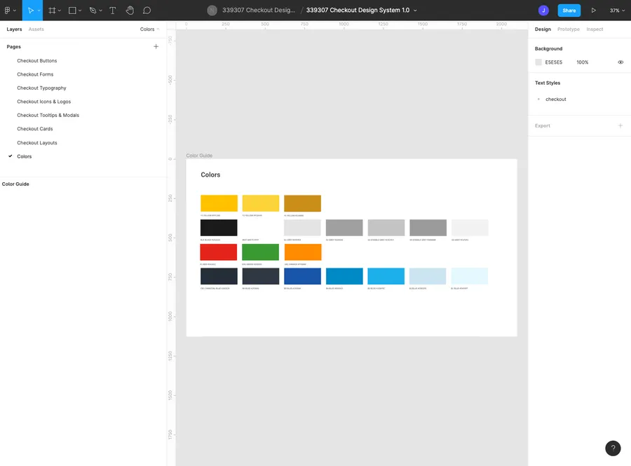
The colour palette mirrored the Norton brand palette and was only included in the design system so any designer using it could find all the assets they needed in one place.
Design systems are integral to any company wanting to rapidly integrate, design and implement large quantities of user flows. As Norton has many flow variations, it proved useful to create the design system. It was really important to me that I create something that was actually useful and not just a box-ticking exercise. Feedback from designers was positive, and it was a practical tool that helped with rapid iteration of flows.